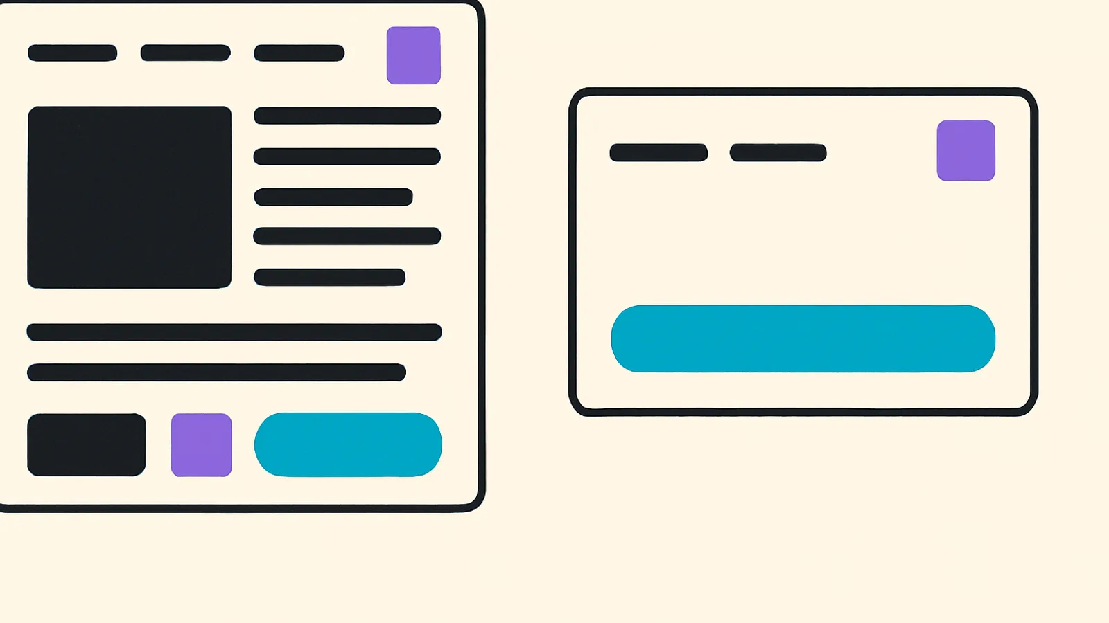
Event registration page: email sign-up and an embed for your own site
Nobody identifies themselves before deciding. We shipped the registration page: email sign-up, content blocks, and a card to paste into your own site.
Getting into a Circli event was always quick for somebody who had already decided to go. But when we started working with free, open events, an objection came up that no better demo could answer.
"My audience doesn't know me yet. Asking them to identify themselves before they even know whether the event is for them is too much."
They were right, and the mistake was ours: we had designed the whole entrance for the person who had already decided. For somebody who is still looking, any step that feels like signing up is too big a commitment too early. People don't abandon because the form is long; they abandon because they don't yet know whether they want to be on your list.
The pain: the event page is the first impression, and ours was a headline and a button
For the organizer, the sign-up page is the hardest-working piece of the whole event. It's what goes on Instagram, what gets emailed, what gets printed on the flyer. And for a long time ours said very little: title, date, a button. Enough for somebody who was already convinced; not enough to convince anybody.
Worse: an organizer with their own site couldn't use it. They sent people away, to another page, with another design — and lost sight of where each sign-up had come from.
For the attendee, the question before signing up is always the same one, and it's very concrete: is this for me? And that doesn't get answered by a headline. It gets answered by photos of last year's edition, by who is speaking, by the agenda, by whether there's parking and whether you can bring the kids.
A page that doesn't answer "is this for me?" doesn't have a conversion problem. It has an information problem.
What we shipped: the page, the form and the embed
First, email sign-up. You land on the event page and fill in email, first name and last name — plus whatever questions the organizer wants to add. No app, no app store, no account to create. The credential arrives by email.
Today that page is the front door of every event: people sign up with their name and email, get their confirmation, and enter the portal with an emailed code or their Google account. No app and no password.
Second, the page stopped being a headline and a button. The organizer can now add blocks underneath the description, and they appear in the order people need them:
- Photos of the previous edition or of the venue.
- Speakers, with a photo and a job title.
- The agenda, so it's visible that there's a real programme.
- Supported by, with the sponsors' logos.
- Frequently asked questions, the things you always get asked.
And there's a design detail we're pleased about: the sponsor and speaker blocks only show up as an option if you've already loaded that information in the panel. Nothing gets copied or re-uploaded: the block decides whether the section is shown, and the rows carry on living in one single place. A switch that turns on an empty list is a dead control, and we'd rather not offer it.
Third, the embed. If the organizer has their own site, they can now put the event on it: a card in an iframe, or simply a button. You copy a snippet from the panel and paste it in. And the sign-ups that come in that way show up as having come from their site, not as loose visits.
The decisions we learned the most from
Registration never happens inside somebody else's iframe. When someone taps the button on the embedded card, the form opens in the full window, not inside the box. It's deliberate: asking for personal data inside a third party's iframe is exactly the pattern that teaches people to trust embedded forms, which is how half of all fraud works. We'd rather have the extra click.
The map is a link, not an iframe. Embedding a map loads hundreds of kilobytes of third-party code into the same page a whole room opens at the same time. A link to the map does the same job and costs nobody any data.
The frequently asked questions don't carry a single line of JavaScript. They're a native browser accordion: they open and close on their own, they work without scripts and — this is the part we like most — they're findable with Ctrl+F even while closed.
Sponsor logos are never cropped. They're shown whole, inside their box. Cropping a sponsor's logo is the kind of mistake you get to see again at the next meeting.
Capacity is communicated as a state, not as a number. The page says whether there's room or whether there's a waiting list. Never how many people signed up or how many spots are left: a public counter is information that works against the organizer every day except the last one.
Event-day mode: the same URL, a different page
This is the one we most enjoyed solving.
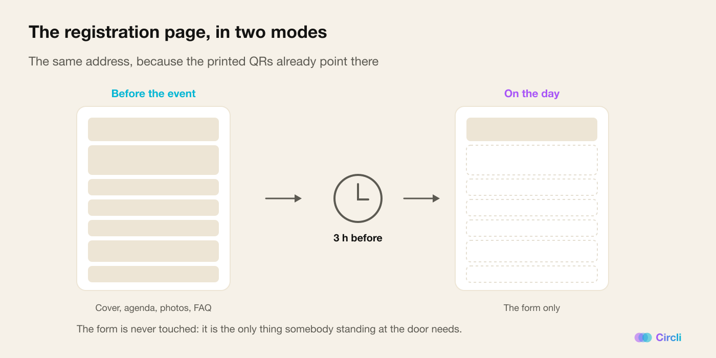
On the day of the event, that same address stops being a sales page and becomes a door. The hero, the agenda and all the blocks disappear. What's left is the form, which is the only thing somebody standing at the entrance needs.
It switches itself on: three hours before the start and until the end of the day, in the event's timezone. Three hours covers early accreditation and setup without eating into days of registration.
And the reason it's the same URL and not a different one is the usual rule: the QR codes that have already been printed point at that address. A printed QR is never regenerated. Sending event day to another route would kill every sign already stuck on the door.
There's a date trap hidden in here that is worth telling, because it affects the whole of Latin America: the event date is stored as a calendar day, with no time. If you read it naively in the event's timezone, in any country west of Greenwich it returns the previous day. A Saturday event would enter event-day mode on Friday. That gets solved by reading the date carefully, and it's the kind of bug you only discover if you test in your own timezone.
What protects the person signing up
- Consent is explicit and written in plain language: what data is used, who uses it, what for, and which address to write to in order to exercise your rights.
- The box for receiving notices about upcoming events comes unticked. Always.
- You can't find out whether an email is already registered. Every response the form gives comes out the same way, so nobody can use it to discover who signed up. It's a boring, necessary defence.
Why it changes the event
For the organizer, the registration page stops being paperwork and becomes the event's best sales piece — and on top of that it can live inside their own site, with the attribution where it belongs.
For the attendee, the barrier to entry drops to the minimum: an email. And before handing over that email, they have enough to decide with.
And for us it's a change of posture: the funnel has two entrances, not one. Whoever has already decided comes in the fast way. Whoever is deciding looks first — and looking costs them no identity.
How to turn it on
Web registration is every event's default front door, and the page blocks are set up from the organizer's dashboard. The caps are per plan — how many photos, how many questions, whether you can show sponsors and speakers — and they're applied on save, never on display: if an event moves down a plan, what it has already loaded carries on showing. Trimming its gallery behind its back would be deleting content without telling anybody.
Running an open event? Discover Circli Events or reach us at events.circli.app.